From Clicks to Consults: How to Design a Wedding Portfolio Website That Converts
by Brian Lawrence
If you're a wedding professional, your website isn't just a digital scrapbook of your best work. It's your hardest-working sales tool. Couples may love your Instagram, but it's your website that ultimately determines whether they decide to reach out.
A beautiful website that doesn't convert is like a stunning venue with no signage and a locked front door. Couples arrive excited, then leave confused.
The good news? You don't need to be tech-savvy to fix this. You just need to design your portfolio website with intention, guiding couples from first impression to inquiry without friction.
In this guide, we'll break down how to design a wedding pro portfolio website that converts, step by step, using plain language and real-world examples. No coding. No jargon. Just smart, client-focused design.
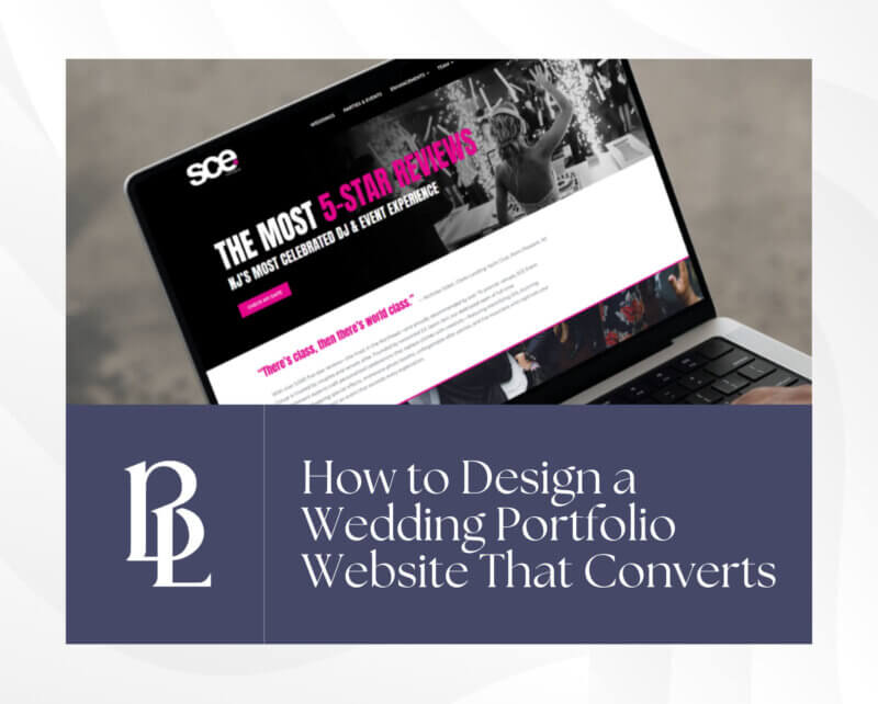
Homepage Hero Section: Powerful Image + Headline + CTA
Your homepage hero section (the very top of your site) is the most important real estate you have. Couples decide within seconds whether they're staying or clicking away.
Start With One Strong Image (Not a Slideshow)
Many wedding pros make the mistake of using sliders or rotating galleries. While they look fancy, they often distract visitors and slow down your site.
Instead, choose one powerful image that reflects:
- Your ideal client
- Your most common wedding style
- The emotion you want couples to feel
For example:
- A luxury DJ might feature a packed dance floor with uplighting
- A photographer might show a candid, emotional moment, not a posed shot
- A venue might highlight a ceremony setup with guests seated
The goal is connection, not variety.
Write a Headline That Says Who You're For
Avoid vague headlines like:
- "Creating Unforgettable Moments"
- "Where Love Meets Elegance"
They sound nice, but they don't tell couples why they should choose you.
Instead, write a clear, benefit-driven headline:
- "High-Energy Wedding DJ Services for Connecticut Couples Who Want a Full Dance Floor"
- "Timeless Wedding Photography for Couples Who Value Real Moments"
This helps with SEO and instantly reassures couples they're in the right place.
Add One Clear Call-to-Action (CTA)
Your hero section should have one primary button, not five options.
Good CTA examples:
- "Check Availability"
- "View Wedding Portfolio"
- "Get Pricing"
Avoid vague CTAs, such as "Learn More." Couples want direction.
Portfolio Strategy: Curate by Style or Venue, Not by Date
Your portfolio isn't about showing everything you've ever done. It's about showing the right work to the right couples.
Why Chronological Portfolios Don't Convert
Listing weddings by date ("Smith Wedding – June 2023") forces couples to work too hard. They don't care when the wedding happened. They care whether it looks like their wedding.
Organize by Style or Experience
High-converting wedding portfolio websites group work by:
- Venue (Barn weddings, ballroom weddings, waterfront weddings)
- Style (Elegant, modern, rustic, cultural)
- Service type (Ceremony-only DJ, full reception coverage, micro weddings)
This helps couples quickly find themselves in your work, which builds confidence.
Add Context, Not Just Photos
Instead of uploading a gallery with no explanation, include short descriptions:
- The venue name
- Guest count
- The challenge you solved
- The vibe of the day
Example:
"This 150-guest ballroom wedding at The Madison Hotel called for seamless transitions and a high-energy open dance floor. The couple wanted a club-style feel without losing elegance."
This storytelling approach improves time on page, helps with SEO, and makes your portfolio feel intentional.
About Page: Make It Personal Yet Client-Focused
Your About page is often the second most visited page on a wedding pro website and one of the most misunderstood.
Couples don't want your entire life story. They want reassurance that you:
- Understand weddings
- Are easy to work with
- Care about their experience
Start With Your Passion for the Industry
A short personal introduction builds trust:
- Why you entered the wedding industry
- What you love most about working with couples
- Keep it warm and genuine, but concise.
Shift Quickly to the Client
After your intro, pivot to how you help couples:
- How you reduce stress
- How you guide them through the process
- What makes working with you different
- Use "you" more than "I."
Include a Friendly Photo
Couples want to see you, not a stock image. A professional but approachable photo helps humanize your brand and increases inquiries, especially for DJs, planners, and photographers.
Inquiry Page: Clear, Concise Form With Next-Step Guidance
Your inquiry page should feel welcoming, not overwhelming.
Keep the Form Short
Long forms scare couples away. Only ask for what you truly need to respond:
- Name
- Wedding date
- Venue (if known)
- Service needed
You can gather more details later.
Tell Couples What Happens Next
One of the biggest missed opportunities on wedding websites is failing to explain the process.
Add a short section below the form like:
"Once you submit the form, you'll hear back within 24–48 hours with availability and next steps."
This sets expectations and reduces anxiety.
Add a Secondary Contact Option
Some couples prefer quick communication. Consider adding:
- A clickable phone number
- A "Schedule a Call" link
- A contact email
Easy access = higher conversions.
Conversion Tips: Add Urgency, Social Proof, and Easy Contact Access
Once the structure is in place, these small details can significantly increase bookings.
Use Social Proof Everywhere
Don't hide testimonials on one page. Sprinkle them throughout:
- Homepage
- Portfolio pages
- Inquiry page
Short quotes work best:
- "Our guests never left the dance floor."
- "The planning process was seamless from start to finish."
If possible, include:
- First names
- Venues
- Star ratings
This builds trust fast.
Add Gentle Urgency (Without Pressure)
Couples often wait too long to inquire. Help them act sooner by adding:
- "Limited dates available for "
- "Now booking fall weddings"
- "Most Saturdays book 9–12 months out"
This isn't pushy. It's helpful.
Make Contact Access Effortless
Your contact link should appear:
- In the main navigation
- In the footer
- On every key page
If couples have to search for how to reach you, you're losing inquiries.
A high-converting wedding pro portfolio website doesn't need fancy animations, endless pages, or complex tech. It needs clarity, warmth, and purpose.
When your website:
- Speaks directly to your ideal couple
- Shows your work in a relatable way
- Guides visitors toward a clear next step
…it becomes more than a portfolio. It becomes a booking engine.
If your website approaches weddings thoughtfully, professionally, and with the client experience in mind, you'll see the difference in your inquiries, your confidence, and your business growth.
And that's a website that truly converts.
Your Work Deserves a Website that Books as Well as It Showcases
If you’re ready for a portfolio website that attracts the right couples and encourages them to reach out, let’s talk about a site strategy designed around real client behavior, not trends.