How Simplifying Your Website CTAs Can Boost Wedding Leads: A Case Study
When it comes to converting website visitors into leads, the way you present your contact information and calls-to-action (CTAs) can make all the difference. In this case study, we examined their different websites and compared performance metrics before and after making changes to how users are prompted to reach out, whether through clickable buttons, text links, or structured content layout.
Case Study Period:
Before: May 2024 – September 2024
After: October 2024 – February 2025
Before CTA Examples
Many of the web page sections below the initial CTA also had multiple text link CTAs along with the button CTA.


After CTA Examples
In our case study, all of the multiple text links below the initial CTA were removed, leaving a single text link with a button CTA or only a button CTA.


Strategic Removal of Direct Link CTAs Led to Stronger Conversions
Client: Collins Entertainment
Industry: DJs, Photo Booth, Lighting

Collins Entertainment home page
Key Changes:
Reduced the number of direct “click-to-call”, contact, and email links on key pages.
Prioritized contact forms and Calendly scheduling over direct outreach.
Kept one key phone number link prominently placed near the top.
Collins Entertainment middle of the page CTA
Results:
Note: All data is pulled from Google Analytics 4 tracking. The client has an embedded third-party DJ Event Planner form on the contact page, which limits form completion tracking.
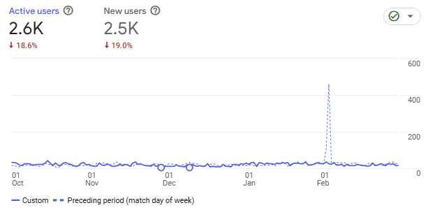
- Fewer people visited the website Oct – February 2025 versus from May – Sept 2024 by 18% (3,170 vs 2,576). Thus, our comparisons will improve further when we can compare year-over-year.
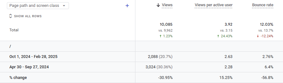
- The website’s bounce rate decreased by 12.24% site-wide. Bounce rate is the percentage of visitors who visited a webpage on the site and then left the website. However, the home page is the most visited page on the website. The home page bounce rate decreased by 56.8% from 6.4% to 2.76%!
- One metric worth tracking is the number of events per active user. This tells us how many people are clicking, scrolling, visiting pages, completing forms, etc. This is a good metric to determine how interested people are in your website and taking action. The average number of events per user increased by 24.15%.
- With the removal of actionable clicks on the website that included the call, form, text, and email links, the number of clicks on the website increased in comparison by 37.39%.
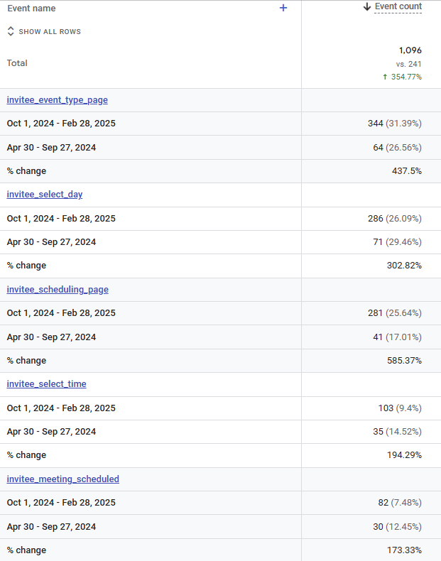
- When reviewing the event invitee_meeting_scheduled (an event signifying that an invitee has successfully booked a meeting through your Calendly link or embedded scheduling widget). The number of invitee_meeting_scheduled events increased by 173.3% from 30 to 80.
- Because many phone and email links were removed, the clicks on them decreased. Email clicks decreased by 52% from 23 to 11. Phone clicks decreased 62% but went from 8 to 3 clicks.
Conclusion:
- Simplifying CTAs and nudging users toward form-based conversions led to better-qualified leads. Keeping one essential contact link visible helped balance convenience with funnel optimization.
Screenshots of findings:
Removal of Repetitive CTAs = More Leads
Client: Momentz Entertainment
Industry: DJ, Lighting, Photo Booth
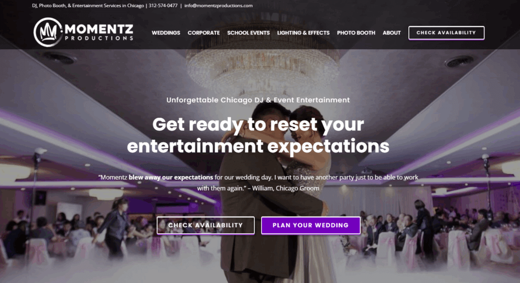
Momentz Productions home page
Key Changes:
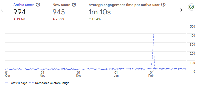
In comparison, the website as a whole saw a decrease in site visitors by 19% but an increase in conversions and visitors interacting with the website more.
Reduced the number of direct “click-to-call”, contact, and email links on key pages. Kept the click-to-call on the phone number in the first paragraph or near the top.

Momentz Productions middle of the page CTA
Results:
Decrease in phone clicks by 30% from 10 to 7, and a decrease in email clicks by 70% from 10 to 3. This was expected with the removal of the repetitive calls to action.
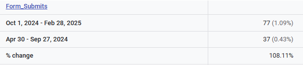
An increase in form submissions of 108.11% from 37 to 77. As a result, the overall leads increased by 40, with 10 fewer clicks on the phone number and email links.
Conclusion:
- Simplifying the number of calls to action and converting text links to clickable buttons proved to be effective in creating less confusion and generating more leads.
Screenshots of findings:

Clear Call to Action Buttons Generate More Leads
Client: DJ Franco Events
Industry: DJ, Videography, Coordination, Enhancements
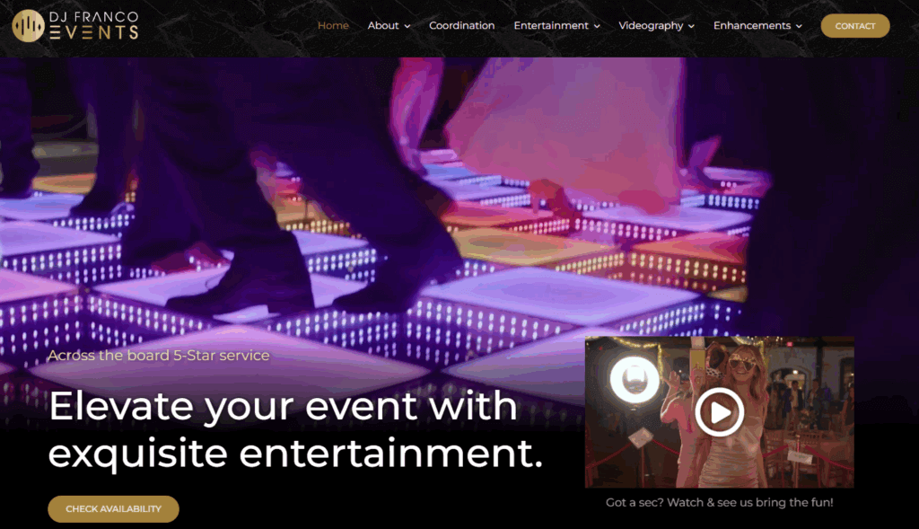
DJ Franco Events home page
Case Study Period:
Before: April 24, 2025 – May 31, 2025
After: June 1, 2025 – July 8, 2025
Key Changes:
- Removing multiple link calls to action to call, text, email, and complete a form on pages. Converted text links into single CTA buttons like “Get In Touch”, “Contact Us”, and “Check Availability”.

DJ Franco top of page CTA
Early Results:
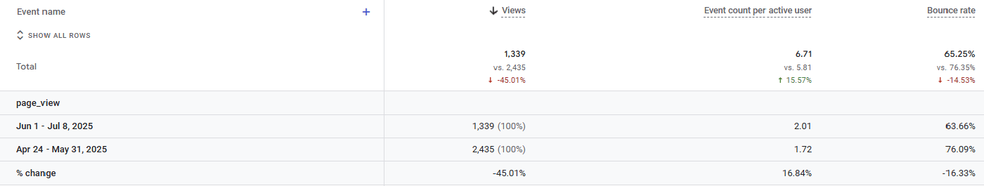
- Note: Results are based on a comparison of 52.9% FEWER visitors in June versus May.
- The website’s bounce rate decreased by 14%.
- The number of events per user increased by 15%.
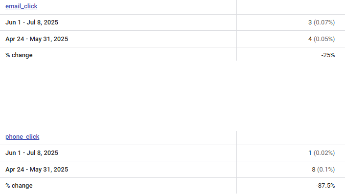
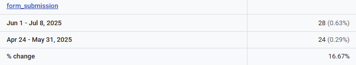
- Form submissions increased by 16.67% from 24 to 28. Phone clicks decreased by 87% from 8 to 1, and email clicks decreased by 25% from 4 to 3. While reviewing the website for collecting data, I realized the site did not have a clickable phone number near the top in the first paragraph. The phone link was added.
Conclusion:
- Simplifying and streamlining the website’s call-to-action (CTA) buttons significantly improved user engagement and lead generation. Despite a 52.9% decrease in website traffic from April to June, the website experienced a notable 14% decrease in bounce rate, indicating that users were more likely to stay and interact with the site. Additionally, the increase in events per user (15%) and form submissions (16.67%) suggests that clear, focused CTAs encouraged more meaningful actions from visitors.
Key Takeaways
Simplified CTAs Improve Conversions
Across all three sites, removing redundant or excessive text links and focusing on a clear button-based CTA (like “Check Availability” or “Contact Us”) led to measurable increases in engagement and conversions.Form Submissions Replaced Direct Contact
Site 1: Calendly meetings increased by 173.3%.
Site 2: Form submissions rose by 108.11%.
Site 3: Form submissions increased 16.67%, even with 52.9% fewer visitors.
Visitors favored structured contact forms over clicking phone/email links.
User Engagement Went Up Despite Less Traffic
All sites experienced fewer site visitors (declines of 18–52%), but bounce rates decreased (12–56%), and events per user increased (15–24%).
This shows that users who stayed were more intentional and engaged.Phone and Email Clicks Dropped By Design
Phone click-throughs dropped as much as 87%.
Email clicks fell up to 70%.
But these were expected and acceptable trade-offs for gaining more qualified form-based leads.
Top-Visible Contact Info Still Matters
Keeping a single phone number link near the top helped maintain accessibility without cluttering the user journey.
Final Thoughts
This case study reinforces a core principle of modern web UX: less is more, especially with CTAs. Overloading a website with multiple ways to contact you can dilute attention and create decision fatigue. By removing clutter, unifying actions behind clear CTA buttons, and guiding users to take one primary action, businesses saw better lead quality, higher form completion rates, and more meaningful user engagement, even during periods of lower traffic.
Ultimately, thoughtful CTA design isn’t just about aesthetics—it’s about optimizing how people move through your site and take action.