Wedding Business Websites Before & After Transformations
by Brian Lawrence and Katherine Meikle
Do you need a new website? Have you chosen to wait till cash flow becomes more favorable? While we feel and clients tell us a new website was their best investment in improving leads and bookings, if you choose to wait, the one thing you want to avoid is to do nothing. There are always things you can do to improve your current website that can be simple but meaningful.
We’ve worked on numerous wedding business websites for clients across the United States and beyond, and whether we’re creating a brand new site for a client or modifying a pre-existing one, initiating that all-important two-way conversation between the business owner and the couple is at the core of what we do. The flow of the site design and the content itself should naturally guide potential customers into contacting you so your expertise, experience and personality can shine. To achieve this, we focus on unique business benefits and the overall visual experience.
Putting Benefits in the Spotlight
Poor content with no strong explanation of benefits is a recipe for being ignored, but on the other end of the spectrum, if your copy comes off as bragging to clients that you are just the best, many couples won’t believe you. Subtlety matters. Your site should feel authentic from beginning to end and that requires the perfect, organic balance.
We put relevant benefits front and center on each page along with carefully chosen testimonials. During the review selection process, we look for what sets the experience apart, and then feature this on the page in both copy and testimonials. Reviews are chosen to match the appropriate service page, which helps clients to see themselves in the aspirational description they are reading.
Telling the Visual Story
Whether we’re working with a DJ or a venue, an officiant or a caterer, we ensure every detail is thoughtfully chosen, from pulling out a bright logo color to add some much-needed energy to pages or utilizing a striking font to showcase a strong personality.
And a site’s visual design isn’t just about color scheme and typefaces – making contact information easily available at all times is an essential step, as well as thoughtfully choosing buttons and calls-to-action which should be placed throughout the site. If a couple reads through your list of benefits and decides they would like to speak with you, you could lose them if your phone, email or appointment scheduler are not ready and waiting. We ensure that potential clients never have to search to have what they need to start that two-way conversation.
Advanced Entertainment offers a number of unique entertainment services including casino nights, music poker and trivia. Originally there was no mention of them on the Home Page and no dedicated service pages. On the new website, these stand-out services are featured using both individual landing pages and sections placed on relevant pages, including on the Home Page, where bold parallax images immediately bring the services to life in a vivid way.
Highlighting what makes the business unique was an important step in the creation of the new site. The “Why Choose Us” section on the old site was easy to miss at the very bottom of the Home Page with a simple design and beige coloring. Now, benefits are clearly shared on every page in an eye-catching design with expanded content utilizing bullet points, a testimonial and more.
New content was key to flesh out the services. The goal was to explain enough to help potential customers develop an understanding of the available entertainment and want to hear more. For example, when introducing the concept of Music Poker, the headline “Your customers will love music poker and here’s why:” grabs attention to introduce benefits that show the value of the option to even a site visitor previously unfamiliar with the service itself. A call-to-action below it makes it easy for the visitor to then get more information by contacting Advanced Entertainment.
This is all supported by high-quality images of happy guests and patrons, illustrating both the services themselves and the entertainment they can bring.
Advanced DJ Services
Before
Advanced DJ Services
After

With something as visual as stationery, illustrative photos are a must. However, finding pictures on Aly Am Paperie’s old site was a challenge, meaning that landing pages were not acting as effective virtual lobbies for potential clients to get a sense of why they should learn more about the business. The old site also did not accentuate the fact they are a storefront, or capture owner Gretchen’s personal expertise and her leadership role in the San Antonio event industry.
A different visual approach was necessary. One of the most transformative examples of this is the new Home Page opening-section slider. Bright, attractively colored invitations (which feature the business’ signature pink) draw the eye as soon as the site appears, then warm earth tones and greenery are next to slide in for a sense of contrast. Within the site, each landing page showcases the variety of beautiful stationery options available through a strong opening image and several coordinated displays.
Originally, information about different types of stationery was not clearly visible, and the single Shop page was towards the end of the menu. The navigation menu now makes it extremely easy for potential customers to go to the page they need and see at a glance that there are options for weddings, corporate, and other event types. It shares more specific information on the printing process and timelines, as well.
Along with pink from the logo, a more personal touch has been woven through the site, highlighting owner Gretchen’s experience and expertise. Testimonials have been added to each page to reflect the ease of working with Aly Am Paperie – a benefit which is particularly appealing for wedding couples who would appreciate a guiding hand during the selection process.
Aly Am Paperie
Before

Aly Am Paperie
After

In order for the Beverly Hills DJ Company website to become modern and cohesive, one very important step to take was optimization – not only for mobile but for desktop screens as well. Fabian, the very talented owner, also wanted a much more elegant look.
Previously the Home Page featured a mix of full-screen banners and sections that had some technical issues such as too much spacing or different alignments. Each section now works together in harmony to express all that makes the Beverly Hills DJ Company unique. There is a lot to display, from a Mixcloud music sample to a preferred vendor gallery, but each section is coordinated to match the site’s new clean look.
- The opening landing page section on each main landing page captures attention with a video which reflects the energy and fun of a successful event.
- All images are varied and relevant instead of the pink flower banners that were featured in the old design.
- Reviews are shown in a striking but readable bright blue that matches the theme color of the site.
- Through both text and imagery, the new site now thoughtfully reflects the versatility that Beverly Hills DJ Company has to offer, from multicultural weddings to event coordination.
Another big shift was rethinking the navigation menu. For example, rather than reviews having their own individual page option (which may often go unclicked), testimonials are now incorporated on every page. Additionally, three separate possible “contact” options have now been streamlined into one. One thing that was added to the current menu was the new “Event Coordination” page, making it easy for site visitors to see this valuable service right away. Navigating the site has become a much more user-friendly and enjoyable experience in general.
Beverly Hills DJ Company
Before
Beverly Hills DJ Company
After

Bush House Estate
The new Bush House Estate website design now feels cleaner and more stylistically calming thanks to elegant, minimalistic white and gray-backed sections as well as soothing pale green shades. Rather than one large chunk of text and then a stream of photos one after the other, each section flows back and forth between content and photos which complement.
The footer has also been made to more thoughtfully reflect the venue and lodgings. Instead of elements like a post archive, accolades speak for themselves and social media icons catch the eye – all in color tones which perfectly match the site’s new theme.
One seemingly small yet extremely important change on the updated site is the use of buttons throughout. It should be as easy as possible for site visitors to find exactly what they are looking for, and offering them a clear, convenient path to the next step for something they’re interested in is invaluable. Buttons also can offer encouragement as a potential client explores, such as with the “See Our Rooms” option.
This is all supported by another key addition: testimonials. Each page ends with an impactful review highlighting the venue’s beauty and extremely accommodating owners.
Bush House Estate
Before
Bush House Estate
After

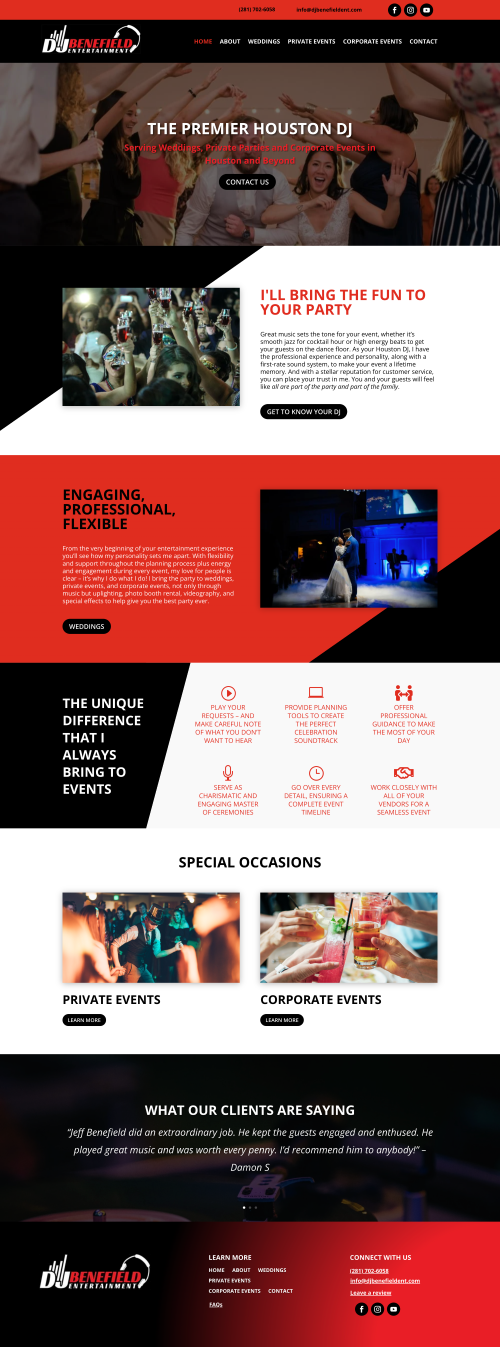
For DJ Benefield Entertainment, working with the color scheme in a dynamic way to bring the pages to life made a dramatic change. Taking the red and black from the logo and designing new sections which work with this eye-catching combination gives the site a new amount of visual interest. The bold shape of the background design also directs attention to copy.
Originally, the site’s third-person site content had an unnatural feel that did not showcase DJ Jeff’s big personality, which was often a key element clients raved about in testimonials and is so important for a DJ/MC. The old copy often also focused on more generic information and educational tips rather than highlighting what makes Benefield’s services unique. We ensured that every headline, bullet point and paragraph brings the experience to life – “From the very beginning of your entertainment experience you’ll see how my personality sets me apart.”
Expanding the pages also gave us opportunities to feature additional services that were not previously discussed on the old website, including 512 combinations of uplighting, special effects and more.
To make it easier for clients to be able to see all the selling points, we added a footer with a navigational menu, contact information, social media and even a Google Business Profile link to help satisfied customers leave a review.
DJ Benefield Entertainment
Before

DJ Benefield Entertainment
After
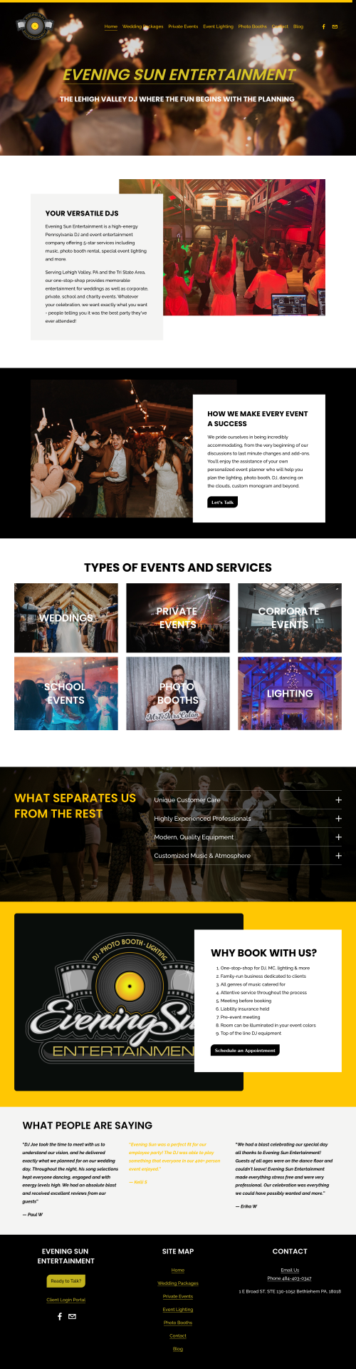
Transforming the Home Page was one of the most important elements of our work on the Evening Sun Entertainment site. In addition to totally reconstructing the long section of content through both writing and design, we added new content to emphasize the benefits at a glance for potential clients. Sleek new sections now offer a modern, professional look with plenty of photos to capture attention. This transformational trend continued throughout the project.
In the redesign of the site we sought a cohesive look from start to finish, including weaving the company logo’s signature yellow in tastefully throughout the pages for a pop of vibrance perfectly fitting a DJ/entertainment service.
Improving ease of use for clients was another key consideration, from splitting up long streams of copy to adding buttons and calls-to-action so that clients never had to spend time looking for a way to schedule an appointment. For example, under “Types of Events and Services”, rather than simply displaying a services gallery, each photo is conveniently clickable.
A major way this came into play was with the services. Descriptions of services were spread out across the site without a clear understanding and location for each. By creating cohesive, well-rounded pages for each, couples can now easily see all that Evening Sun Entertainment has to offer.
Evening Sun Entertainment
Before
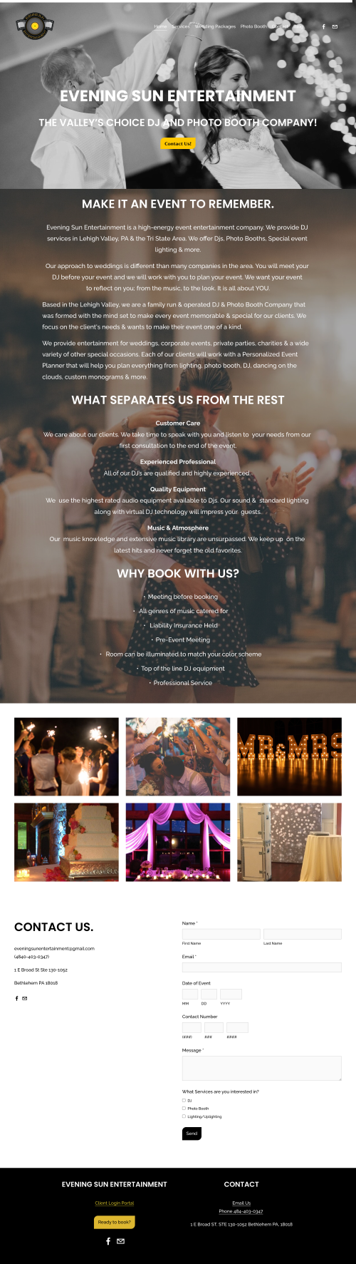
Evening Sun Entertainment
After
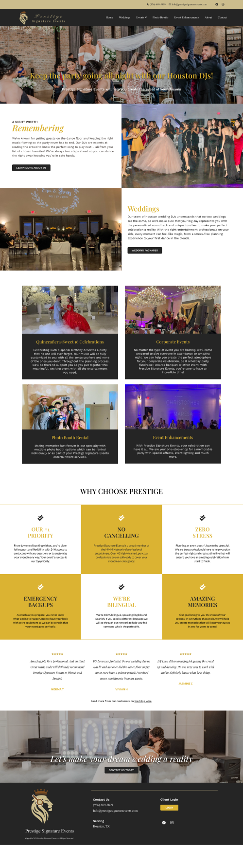
With their gold, gray and white color scheme, we designed a site that would fit Prestige Signature Event’s elegant theme. Multiple shades of gold pop thanks to the addition of black as an accent color to add depth and contrast, something site visitors will see immediately through the new navigation bar, which now features visible contact information to make initiating the two-way conversation even easier.
The biggest change in the new site was the additional pages which included thousands of words of content and handpicked testimonials. These were created to best represent every service offered, from each event type to add-ons such as photo booths and event enhancements. This was especially necessary given that pricing was to be featured on the site.
One of the most intrinsic necessities for displaying pricing on a site is showing why you are worth that price beforehand so that the couple understands your value rather than simply judging a number. Originally, Prestige Signature Events had no service pages, only package information. This meant that potential clients did not get a chance to see all that they would be getting, including intangible but highly valuable benefits, such as being able to have all the entertainment services they could need from one company, and dedicated assistance during the planning process to ensure a stress-free celebration.
Prestige Signature Events
Before
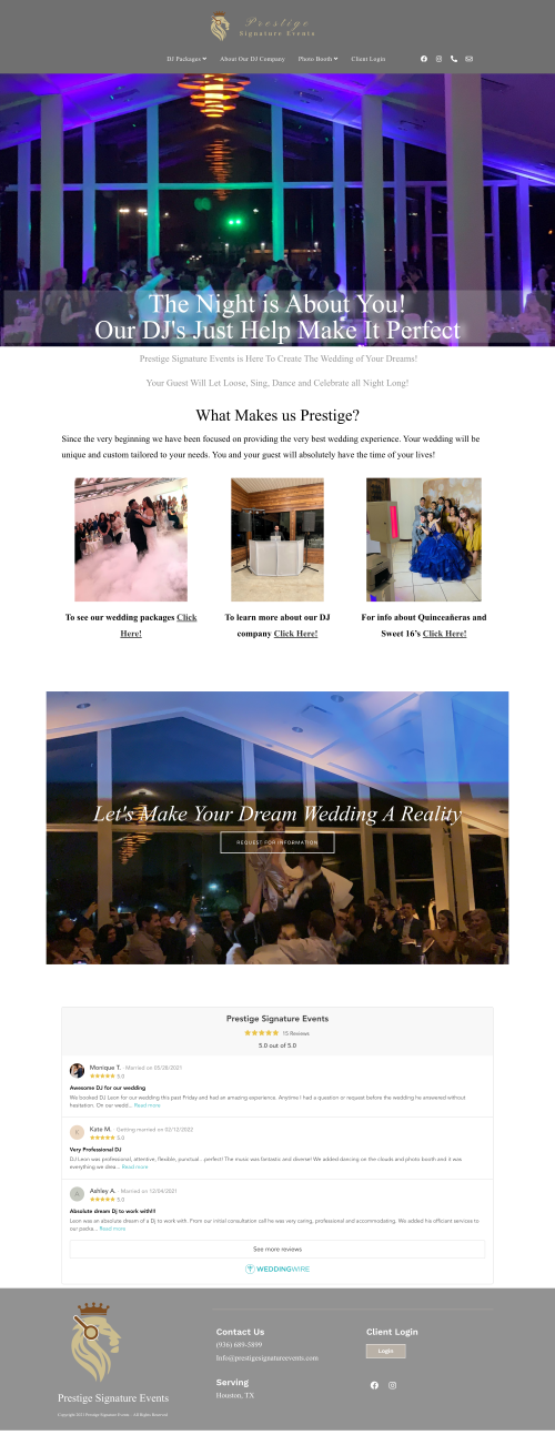
Prestige Signature Events
After
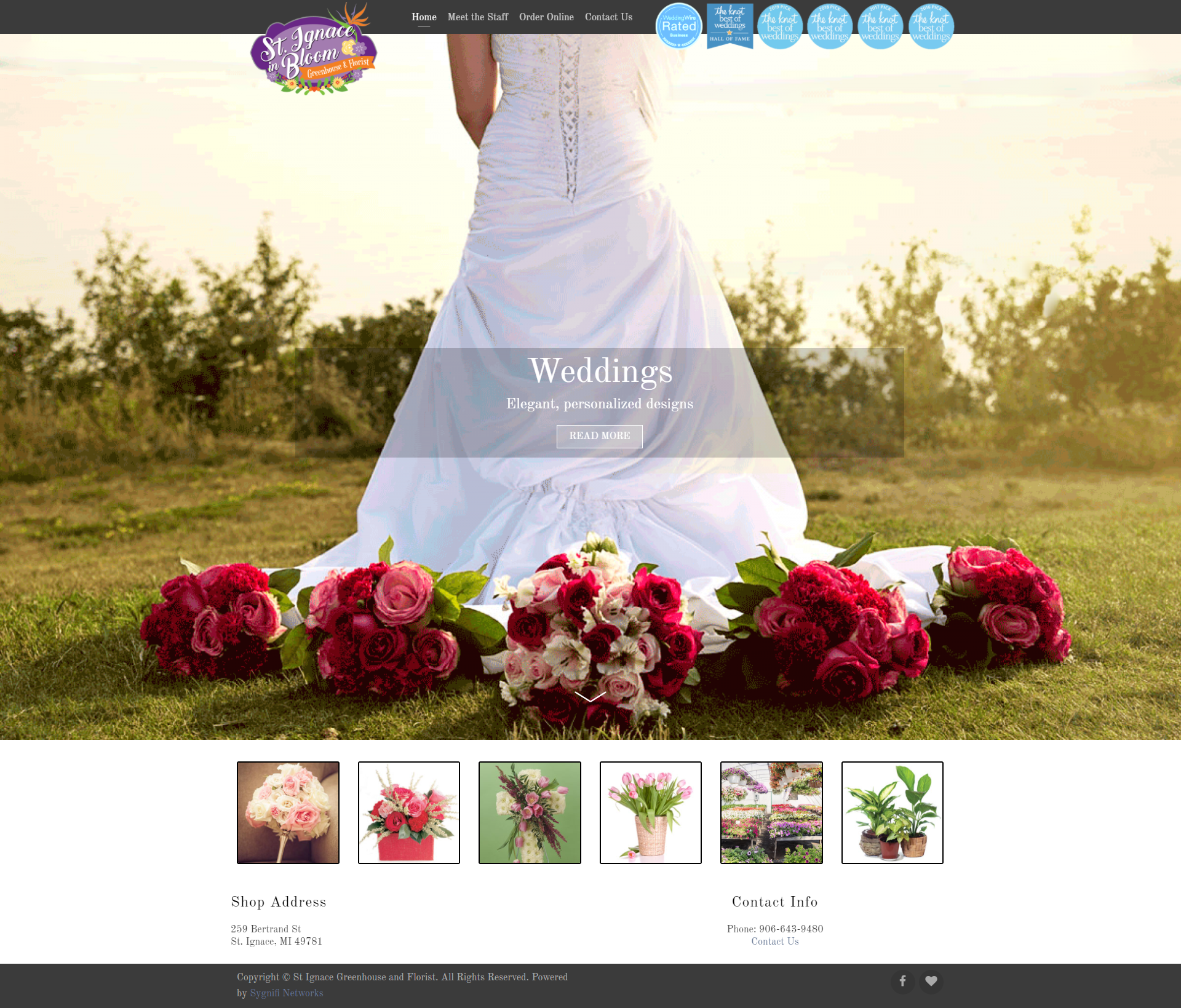
One of the most important functions of a Home Page is to act as a virtual lobby to warmly welcome and guide visitors to get key information about services/products. When that Home Page has no content and no service pages to create a pathway to, the system of communication is broken. This creates a frustrating experience for potential clients and is something that we knew would be fundamental to address in the new website for St Ignace and Bloom – a greenhouse and florist combination offering both beautiful, locally sourced event florals and products including their famed giant planters.
And when working to showcase something as visually-stimulating as flowers, the site must function not only as a lobby but also as a gallery, with representations of real bouquets, centerpieces, etc which can be used to draw the eye, display possibilities, and spark feelings of joy. This is especially true with the grand hanging planters, which are now displayed on the site with the bright florals cascading over and looking larger than life.
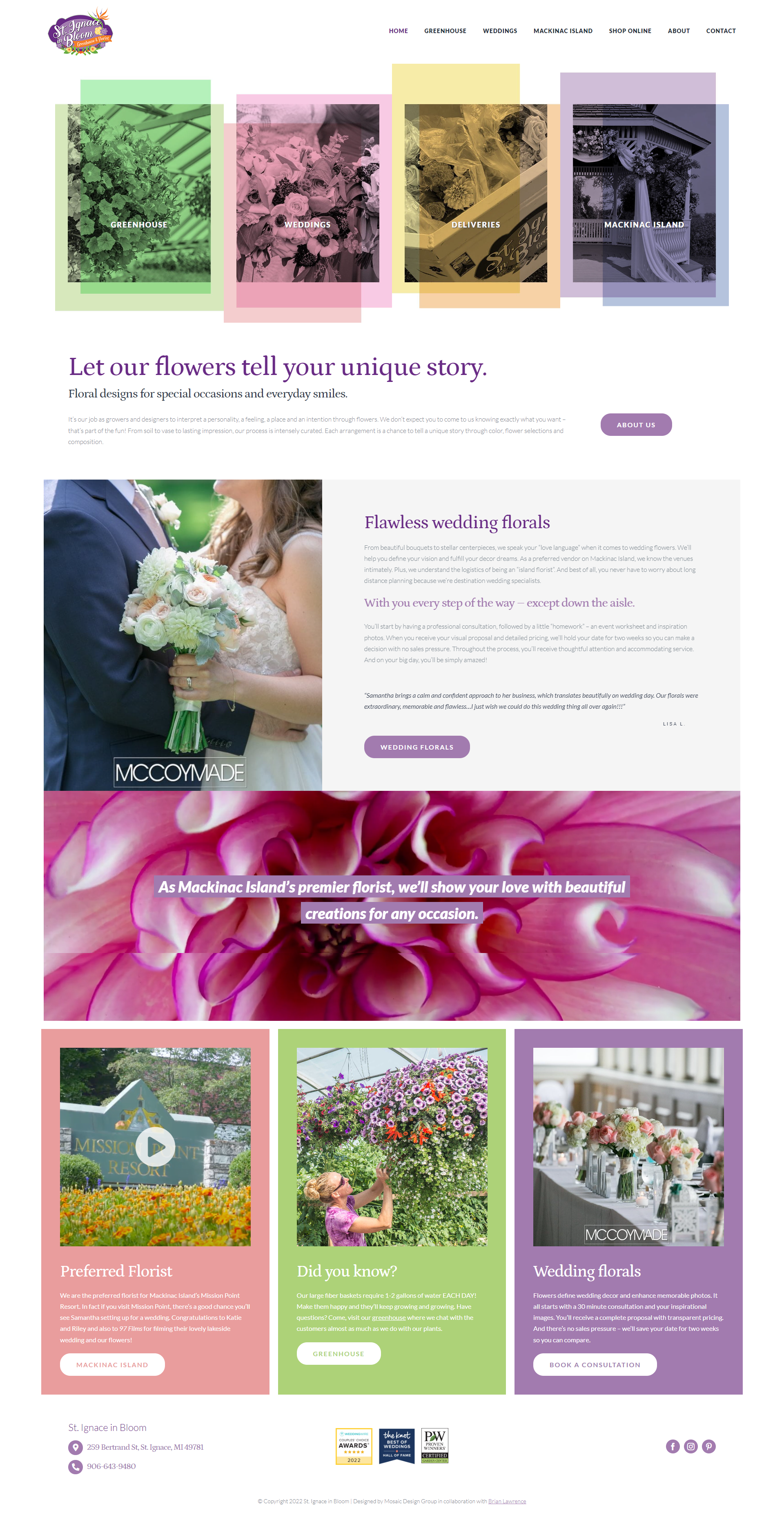
As a whole, the site itself is now bigger, with valuable new service pages which will dramatically improve the user experience through richly descriptive content, easy-to-follow calls-to-action, glowing testimonials, and thoughtfully-designed displays
St. Ignace in Bloom - Greenhouse & Florist
Before
St. Ignace in Bloom - Greenhouse & Florist
After
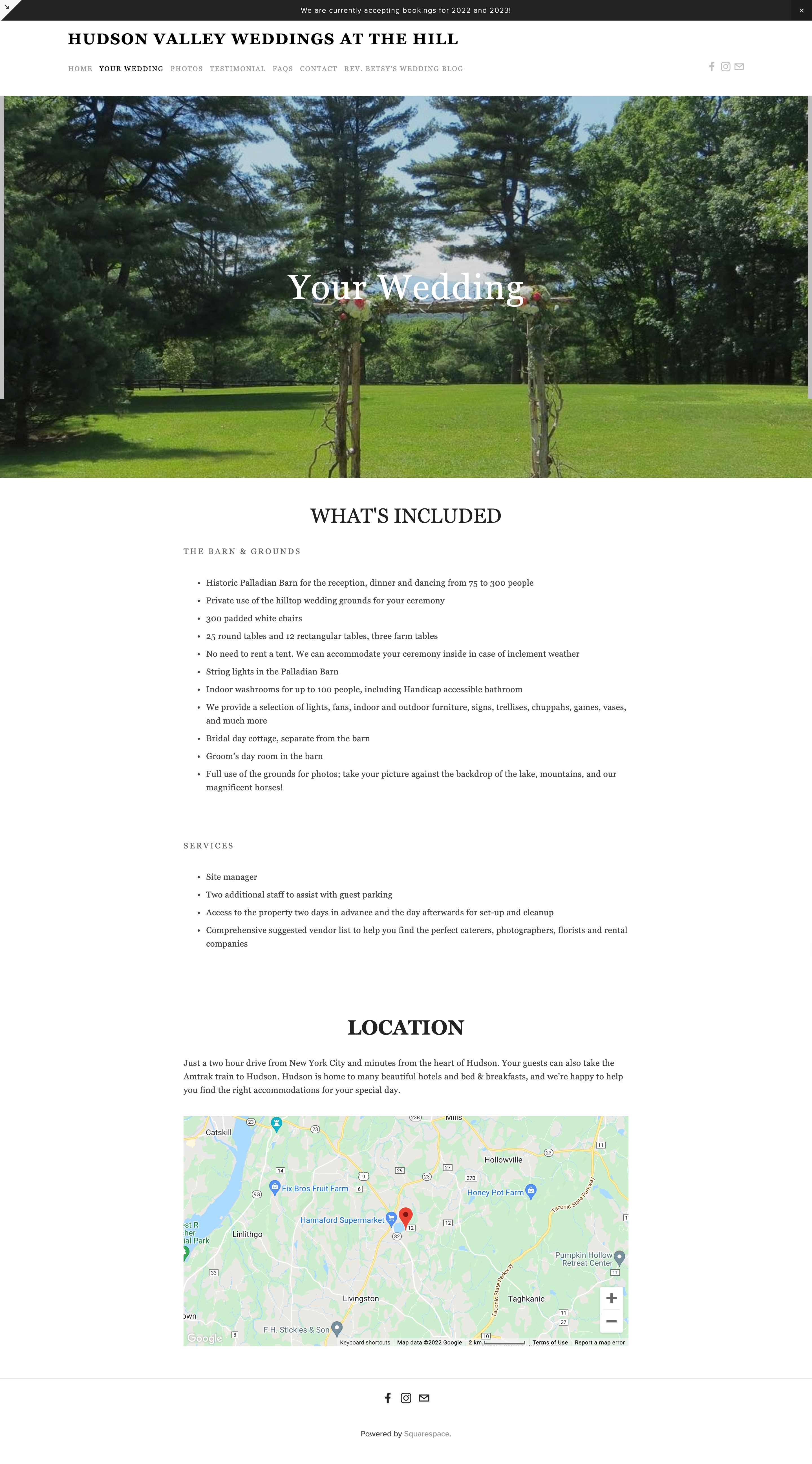
When working with any venue, smart choices with photographs are a must. The Hill’s website originally did not showcase the stunning scenery, range of amenities and multiple historic on-site locations effectively. For example, there were no photos on the Weddings page and the previous Gallery featured one large photo and then a number of miniature pictures which had to be clicked through to see properly. We’ve woven photographs as section accents and in mini-galleries throughout the site. The Gallery now also serves as a source of inspiration with clear looks at how each element of the space can be transformed.
Thoughtfully restructuring the pages and page menu was another very important step during the modifications process. First, we incorporated relevant testimonials on each page. This allowed us to get rid of the Testimonial page, which simply featured a long, single testimonial that would likely not be read. Then, the small amount of content from the FAQs page was shifted to the Weddings page, making it easier for potential clients to get answers to their questions after exploring the Weddings sections. Next, we introduced the venue owner’s blog (which is hosted on a separate site and has not been updated in recent years) as a button within a landing page rather than as an option on the main menu, inviting readers to discover the blog organically instead of unintentionally clicking on it first and leaving the site. Finally, we added an about page entitled “Our History” to create an additional opportunity to feature all that the venue has to offer while immediately drawing attention to its rich history right from the navigation bar.
Sharing what makes The Hill special was achieved throughout the revamped site thanks to new copy, which featured appealing benefits and highlighted unique elements through clean and elegantly designed sections.
The Hill
Before
The Hill
After

Tailored SEO Strategies
The SEO work done behind the scenes may not be shown in Before and After photos but it is a deeply necessary foundation to support and sustain any website. SEO analysis, researched keywords, Schema creation and back-end SEO optimization are all steps we take for clients to ensure that their websites will have an audience. Each process is customized to fit the needs of that specific client.
Ready to Get Started?
Whether you’re interested in a brand new website, consultation during the design process or cost-effective modifications, we can help.
- To learn more about what we can do for your website, book a free consultation.
- To see more of our web design work and learn about how we can help weddings and event businesses like yours, view the service page.


